Tuesday, November 16, 2010

Politics and Colour

I chose to do a poster based on an issue in Vancouver. I chose to portray the homeless situation and the lack of affordable housing in the style of a Russian WWII poster. The colour scheme is the same as many posters of the era which was 2 colour screen prints. Considering that this message needed to reach the masses, 2 colour printing would and is more cost effective than full colour especially when money needs to be saved in an effort to fight war. The fonts used are the fonts very popular in American posters. Futura was probably the most used, as well as slab gothic such as avantgarde and franklin gothics. Because lettering was hand painted, artists tended to use these blocky slab fonts in order to save time and frustration in the actual creation of the design.


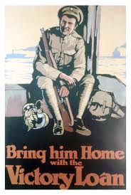
The slogan came from this American WWII poster I found that encourages Americans to buy Victory bonds for the future as well as aiding in the war. I thought the same kind of slogan, which was and is still effective in it's clear message would helping in the message of homelessness in Vancouver.


Sunday, November 14, 2010

Classic Colour Schemes and The Simpsons

To show how much of a colour geek this class has made me thus far, I give you this post. So I was watching the new episode of The Simpsons tonight, one of my favorite shows, and while watching noticed all the various colour schemes used in it. All the colours are high chromatic and use variations of all the classic colour schemes at once. A lot of cartoon use very primary, very pure colours, I'm assuming which started out in animation in order to keep children's attention but now seems to denote just a cartoon or animation, in and of itself.

The Simpsons Kitchen for example uses a triad colour scheme of purple, orange and green. Marge Simpson and Bart Simpson with their outfits both have the triad colour scheme as well. I've always liked the look of The Simpsons, and I knew the use of bright pure colours was one of the reasons that attracted me but now I'm wondering if the colour schemes have something to do with the visual appeal as well.


Dale Chihuly - Glass Artist using Light and Colour


This artist I had never heard of before until tonight I saw a documentary about him installing a glass installation in San Francisco. His work uses a vast array of highly saturated colours. The medium of glass also allows for even play with colour and form when the light shines through at different angles. Each piece uses a variety of colours or a singular colour to create dfifferent moods. All the piece are just awe inspiring.

Monday, November 1, 2010

Me Posting About Yet Another Artist Using Light

Amazing Building Mapping - Vimeo Festival from Dan Ilic on Vimeo.


After talking about it in class, I'm noticing and stumbling upon more and more artists playing with light. This one is really cool.